Branding A Music City
- Jeffrey Martin
- 01 Sep 2017
A Conversation With Designer Walter Pick
By Jeffrey Martin
In 2016, the city’s Music Industry Working Committee (MIWC) embarked on a long-awaited marketing and branding initiative. A marketing plan was developed to support the music strategy’s four goals: 1) strengthen the local music industry, 2) grow audiences and appreciation of music, 3) increase access to music experiences, and 4) cultivate music creation and talent. The branding exercise was to symbolically capture the key characteristics of Hamilton’s music scene. Not an easy task.

Like any creative endeavor, it starts with some type of research: direct observation, reading, first-hand experience, focus groups, surveys, public engagement sessions and others. Until this critical step has been accomplished, the creative design process does not begin. The city of Hamilton’s request for proposal process resulted in the Pier 8 Group and Walter Pick of Headspring Marketing being selected to develop the marketing and branding project. One of their first major tasks was to conduct some qualitative research within Hamilton’s music community. This included a review of the music strategy and several Music Canada reports, more than 20 interviews with local music industry leaders, in-person, email and phone conversations with musicians and music business owners. All to hear first-hand about their experiences, suggestions and identify important issues. It provided the green light to begin the creative process.
urbanicity sat down with designer Walter Pick to get some insight into the creative process that takes place in developing a brand, and specifically Hamilton’s recently launched “city of music” brand.
Hamilton has a very vibrant and diverse music scene, so the challenge according to Pick was to find ways of representing this vibrancy and diversity that are fresh or something you haven’t necessarily seen before.
“There were so many iterations before I came up with this final design,” says Pick. “There’s all kinds of symbols that are associated with music — music notes, different time signatures, treble and bass clefs, musical instruments, etc. But I really didn’t want to use any of them as they’re very cliché and they’ve been so overused. And they don’t really say anything specific or unique about our city. So you try all these things and it pushes you in one direction or another, and sometimes you’re not exactly sure where it’s going. Elements intersect and you come up with something totally unexpected. I think that’s what happened with the city of music design.”

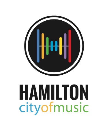
Starting with a few different but simple graphic elements, Pick’s initial idea was to use a sound level meter that is part of the recording process. He also wanted to subtly incorporate the letter “H” to represent Hamilton … the Hammer.
“I wasn’t planning on using level meters but I thought perhaps I can put a horizon line with a ‘0’ level reading with waves above and below the line. I saw the ‘H’ coming out of the level meter – expanding out from the centre as sound waves do. That led me to creating a circle where Hamilton – the ‘H’ – is at the centre.”
The next challenge for Pick was how to incorporate the idea of diversity into the design. His first choice was of course colour. Making the sound waves different colours was a great way to represent the music scene’s diversity – both music genres and cultures.
“Initially I had a solid black circle – but it didn’t quite work for me on its own. As soon as I put another black rule outside the circle, it became something else and it pulled the entire concept together and gave it more meaning. And coincidentally, it did give the effect of being a turntable platter, a CD or vinyl record or the sound hole in an acoustic guitar. So the circle and line became sort of a symbolic ‘window’ and made it a much stronger design concept.”
Including the word “Hamilton” somewhere in the logo was another important design element. “I wanted to really ‘ground’ it by using a solid black typeface. And again to emphasize music diversity, I used colour for ‘city of music.’ In the end, it was combining a graphic symbol with letterforms so that letterforms had gravity or wings. It all tied together and I think it works well as a whole and in a number of different applications.”
Pick also loved the idea of using the music strategy’s simple and straightforward vision statement as a community tagline. “‘Celebrate all things music.’ It’s a meaningful statement because we’re doing exactly what it says – and that’s celebrating all thing music in Hamilton. And it’s all-inclusive. It embraces everything happening in Hamilton’s music scene – whether it’s music education, live performances, buying and listening to music, or simply celebrating the amazing musicians and songwriters who make it all possible.”
And while the graphic elements came together in an unexpected way, Pick acknowledges that this is part of the fun, challenge and reward of being a professional designer.

“You don’t really think about the process – you just do it. When you’re creating, like musicians, you’re in a certain zone, and things lead you to different things. But what ends up happening, one element starts to take over. You don’t really understand what you’ve done until you’re finished and sit back and look at it, evaluate it. It’s a strange process but in many ways it’s much like songwriting. The final song doesn’t come together until you’ve got the chorus, melody, the bridge, arrangements, etc. You don’t filter things. You just let creativity take you in different directions. And you end up with something you’re much happier with in the end.”
What has really made this particular project so meaningful to Pick, was despite presenting several different versions, it was the final concept that everyone gravitated toward immediately, something he says rarely happens.
“It just never happens. It’s not often when everyone on a client’s project team agrees on one design. But this concept simply resonated with the entire music strategy team. It was unanimous. So I want it to have a positive and emotional impact on the Hamilton music community, on Hamiltonians and on Hamilton music fans – and also that people do get excited about it. And they should because this city has a vibrant, diverse and exciting music scene and I hope my design has captured it.”
Comments 0
There are no comments


Add comment