Print Isn’t Dead
- Julia Kollek
- 05 Nov 2018
All Sorts Press proves the past is never that far away

Ever wondered where the expression mind your Ps and Qs comes from? Or why letters are in Upper or Lower Case?
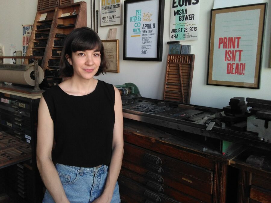
Sara Froese can tell you. She founded All Sorts Press, where you can spend hours opening drawers with trays of classic fonts – and watch her hand-make wedding invitations, notebooks and your bespoke business card.
You could say she’s part of the analog revival, a nostalgic yearning for a return to craftsmanship. (Her Insta followers can’t get enough mesmerising videos of her heavy-duty cutting machine slicing a wedge of cardstock as if it were a stick of butter.)

But her path to print wasn’t immediate.
Sara studied etching and lithography – but letterpress wasn’t in the curriculum. After school, she took a job in a café in London, Ontario, and followed her passion for playing violin in a band, setting off on the road between shifts.
Then – she saw a handbill a musician had printed in his garage. And she was hooked.
A small tabletop press came first, but Sara soon graduated to something truly heavy metal: a hand-fed 1910 Chandler & Price platen-style printing press, listed online because the printer’s son was moving over to digital.
It’s no simple matter to move nearly a ton of cast iron, and even today, the big machine sits in Sara’s Cotton Factory studio on the pallet the forklift scooped it up with.

You can see why these giant pieces of history are so mesmerising. There are wheels, cogs and small red caps for where the oiling goes – they’re simply masterpieces of antique engineering.
At one time, nearly every print shop across the US had at least one of these Chandler & Price presses.
And Sara took it back in time even further by converting it to pure mechanics. She took off the motor and put in a foot treadle she bought from an old guy in Scarborough who collects and restores everything from this bygone world.
She found retired printers downsizing who faced the sad horror of trashing their beloved font trays. They were delighted when Sara showed up and came to the rescue. She found herself catapulted into a community of mentors.
Typesetting is laborious, a combination of passion and patience. Each wood or metal letter must be set individually in a composing stick – backwards. That alone takes a special gift of spatial thinking. Then the plate is inked, the paper hand-fed and the printing foot-pedalled.
And if tiny gaps in the print show, there’s no photoshopping the nicks in the type that result from a hundred years of wear and tear.
So what makes this slow-world process so special?
“I just love the craft,” she said. “You’re literally making an impression on paper – one at a time. You can tell it’s made by hand – it just looks and feels different.”

Her music and printing world combined recently when Hamilton band The Arkells commissioned her for their album “Rally Cry”, incorporating her text digitally into their cover design.

Wedding season kept the press busy with invitations. Now that the festive season’s approaching, Sara’s gearing up with notebooks, cards and printed gifts that are stocked in stores locally, in Toronto, and across Ontario.
In an unrestrained world, she’d love to spend all her time applying her design talents and printing skills to just making posters.
Well, one day.
As for the Ps and Qs, the pieces of type look the same because they’re backwards till printed, so to avoid mistakes, the two were kept far apart in the shallow wooden tray compartments. And Upper and Lower Case? For quick access, the capital letters were arranged along the top, or “upper” case in the type tray, while the small letters were at the bottom or “lower” case.

The past is never that far away after all.
Comments 0
There are no comments
Add comment